Patron, The Oxford Cultural Collective
Photograph: Dan Jones, Food styling: Joss Herd, Recipe: Jordan Bourke
29th May 2019
Part of the Oxford Cultural Collective ‘Perspectives on Food in Photography’ initiative.
Jean Roberts, Patron of the Oxford Cultural Collective, recently met with Alice Patient, Picture Editor for Waitrose & Partners Food magazine, to explore how the company uses photography to strengthen its brand identity and to build positive and trusting relationships with customers. The magazine is offered free as a gift to myWaitrose members and has become the scheme’s most popular benefit. It is published by John Brown Media on behalf of Waitrose & Partners.
The word brand is used pretty loosely these days, but it’s clear that it’s about people’s gut feel about a company, how they actually perceive what it stands for and how they feel about the way it conducts business.
Brand is essentially about a relationship, it represents a promise to the customer. How well the promise is delivered will determine what customers say about the organisation. ‘Your brand,’ as Jeff Bezos of Amazon reminds us, ‘is what people say about you when you are out of the room.’ Strong brands don’t just happen, branding is a process of continually building awareness and loyalty through every dimension of an organisation, both internally and externally facing. How an organisation operates on the inside should be inextricably linked with how it wants to be perceived on the outside.
The telling of the company story through visual language – what people see – is a hugely influential part of the process. Consistency in brand identity allows audiences to build a memory structure about the character of a company and what it has to offer. Everything a company does for its brand is like a point on a canvas. The more dots in the picture the more vivid and colourful the brand becomes, like a pointillist painting.
The Waitrose & Partners Food magazine provides a platform for the organisation to communicate with customers, highlighting messages that are core to the brand, bringing them into sharper focus. It also invites customers to interact with the brand and create a richer picture of it in their minds – a process that strengthens the relationship between company and customer.
Jean Robert’s conversation with Alice began with a focus on how Waitrose & Partners demonstrates its brand identity and values through photography.
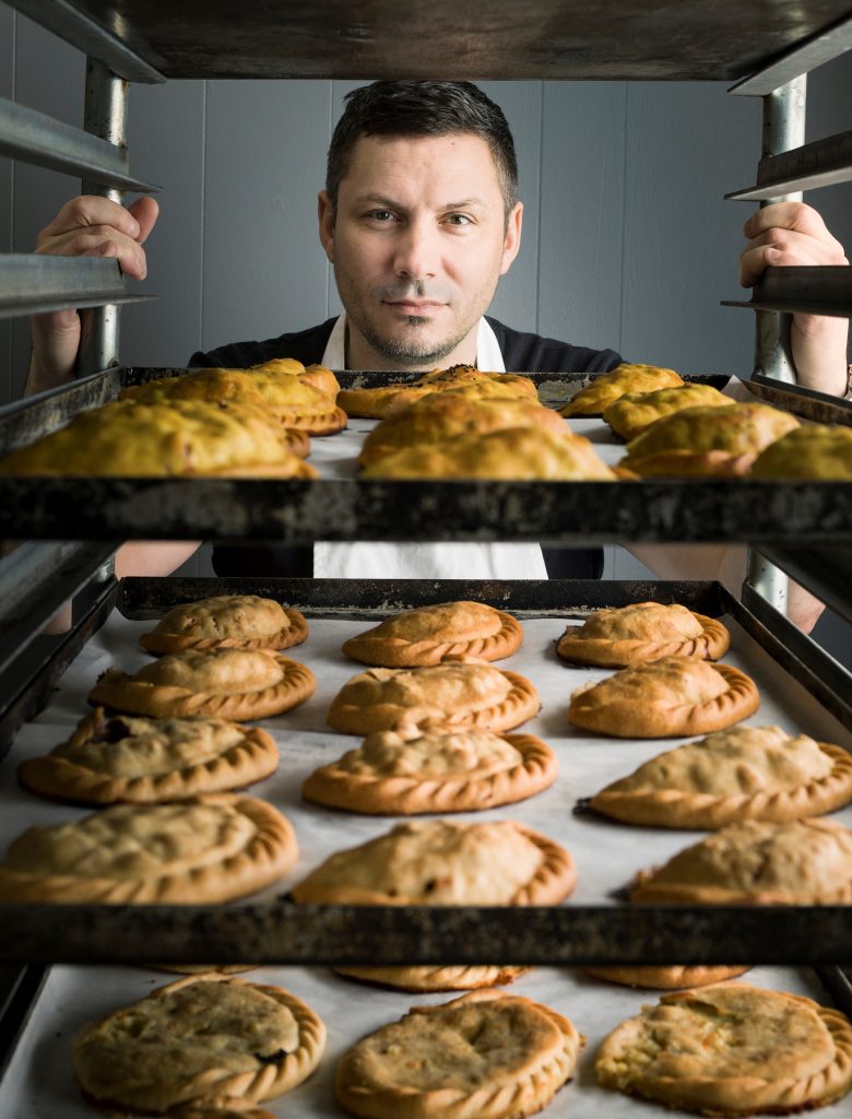
Jean… The magazine often features the people behind the products. To highlight your approach in this respect, tell us about the brief you gave your photographer for this feature on bakers. How did you work with your subjects to get the photographs you wanted. I would imagine words like trust, reliability, hands on were discussed. Tell us a bit more about how you think photographs of people working behind the scenes helps to enhance relationships with your readers? What values do you hope to portray through the photographs?
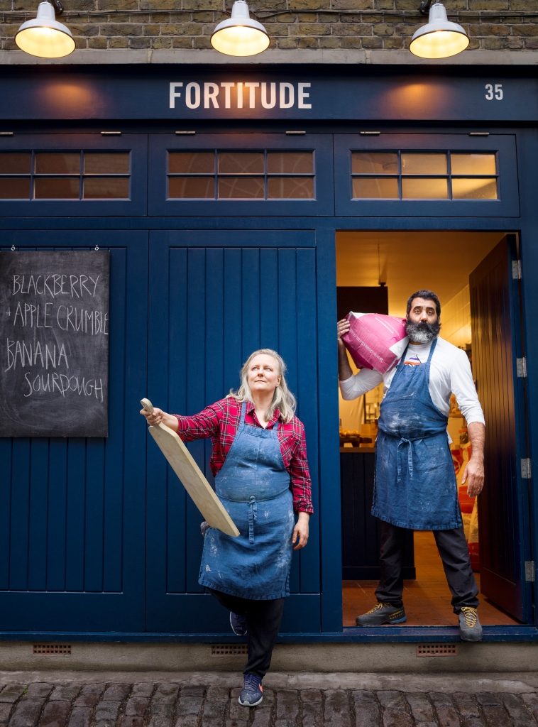
Dee and Jorge – Fortitude Bakehouse. Photograph by Pål Hansen
Alice… We picked top portrait photographer Pål Hansen for the Bakers feature. Having often worked with him in the past we know he is fantastic at building up a rapport with the subjects he photographs and creating very striking portraits. I briefed him that we wanted to shoot the bakers in their own environments and with a baking prop to give some context, but that the focus should be on getting strong, empowered, majestic portraits of the subjects, in keeping with the focus of the story: ‘bakers changing the world’. It’s a fascinating story for our readers, showcasing bakers who are, amongst other things, working with women who have experienced exploitation. The feature fits well in a magazine for Waitrose & Partners – a company where social and environmental responsibility is important.
Lee Wakeham. Photograph by Pål Hansen
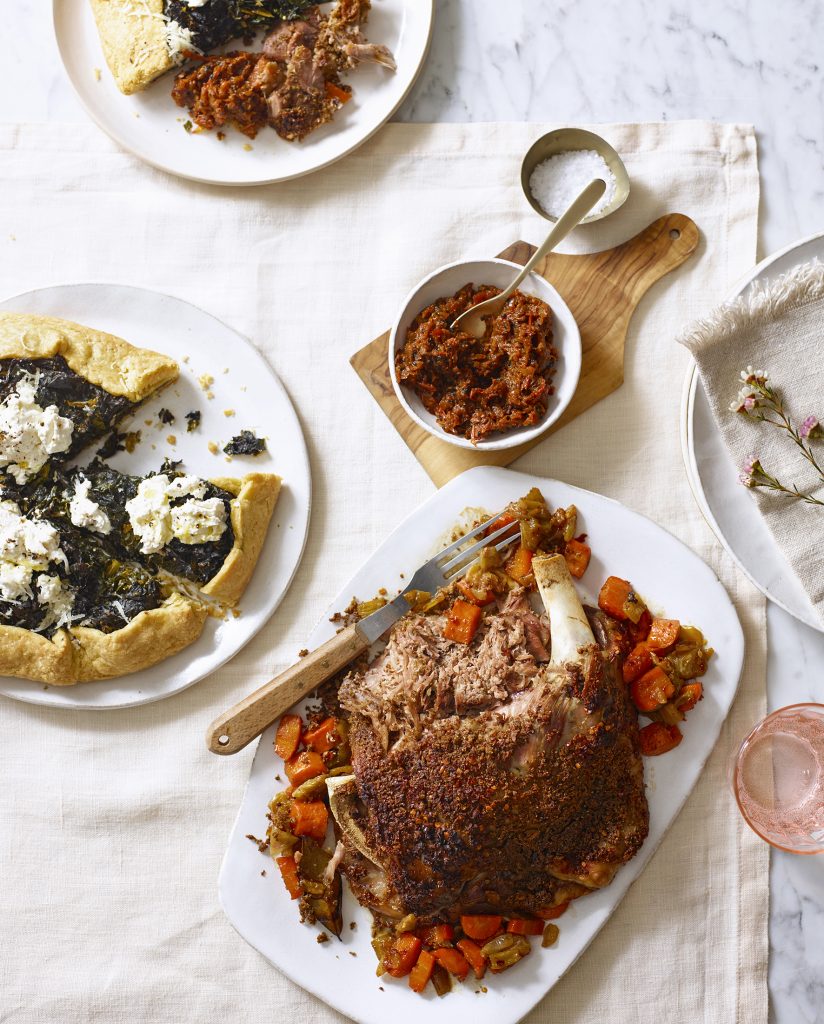
Jean… When it comes to the visual impact of your magazine, you are clear that it’s a team effort. Referring to specific recipe photograph examples from your ‘My Weekend Menu’ feature in April 2019, could you explain your role as picture editor and the roles of the food stylist and prop stylist. How do you represent qualities such as fresh, crunchy, delicious through an image? How do you make your recipes look achievable and desirable?
Photograph: Tara Fisher, Food styling: Jordan Bourke, Styling: Luis Peral, Recipe: Skye Gyngell
Alice… Creating the food photographs in the magazine is very much a team effort. The recipes are written in house or by outside contributors, and the writers give thought to how the recipes will look when photographed, as well as how they taste. Once we have the recipes it is up to me and the other members of the art team – Kerry Wakefield (Art Director), Katerina Varnavides (Deputy Art Director) and Sarah Tang (Art Editor) – to brief the prop stylist and/or art-direct on the day. We share out the shoots between us.
Skye Gyngell’s ‘My Weekend Menu’ feature is an example of a food shoot which I art-directed. I first commissioned photographer Emli Bendixen to shoot a portrait of Skye at her restaurant Spring. She took this beautiful image with lovely light, we then showed the portraits to the prop stylist, Luis Peral, for the food shoot, so he could pick up complementary props, e.g. marble surface, yellow tones. On the day, food stylist Jordan Bourke cooked and styled the recipes and it was a collaborative effort between myself and the photographer Tara Fisher to place the props and choose the camera angle. Jordan and food editor Lucy Battersby decided on how best to style the food to make it look its best. For instance, the lamb was delicious, but in the first photograph we took it looked like there was a large expanse of brown meat, so we had to break up a bit. We decided to cut into the lamb and galette to show it plated at the top of the image, which gave it a much more relaxed feel. Tara used natural lighting to make the images look bright and spring-like for our April issue, and the overall feel is one of a beautiful yet achievable menu which the readers will hopefully want to try at home.
I think that what also helps the food in our magazine look so desirable is that it’s real. The food cooked on the shoot can be eaten and we cook it exactly to the recipes in the magazine. We’re not using trickery – this isn’t the 1980s when our art director Kerry said the food on magazine shoots was all glazed in varnish!
Skye Gyngell. Photograph by Emli Bendixen
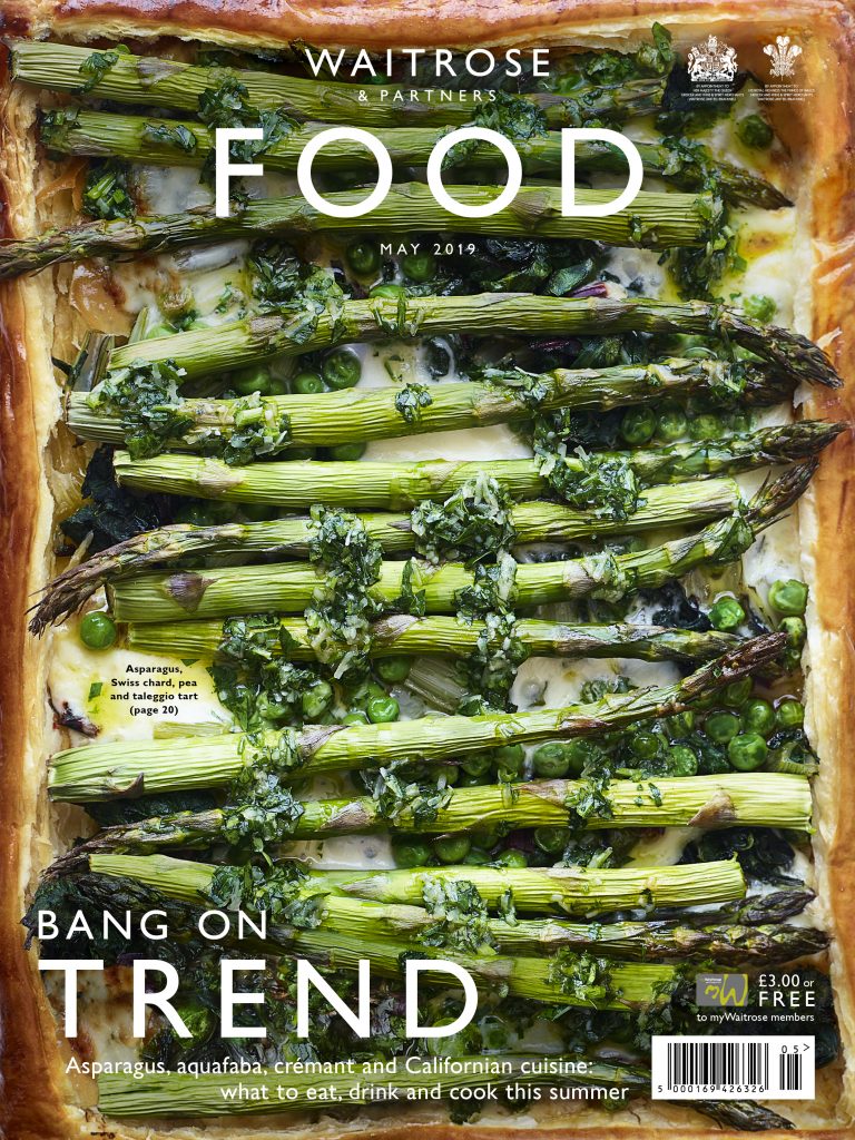
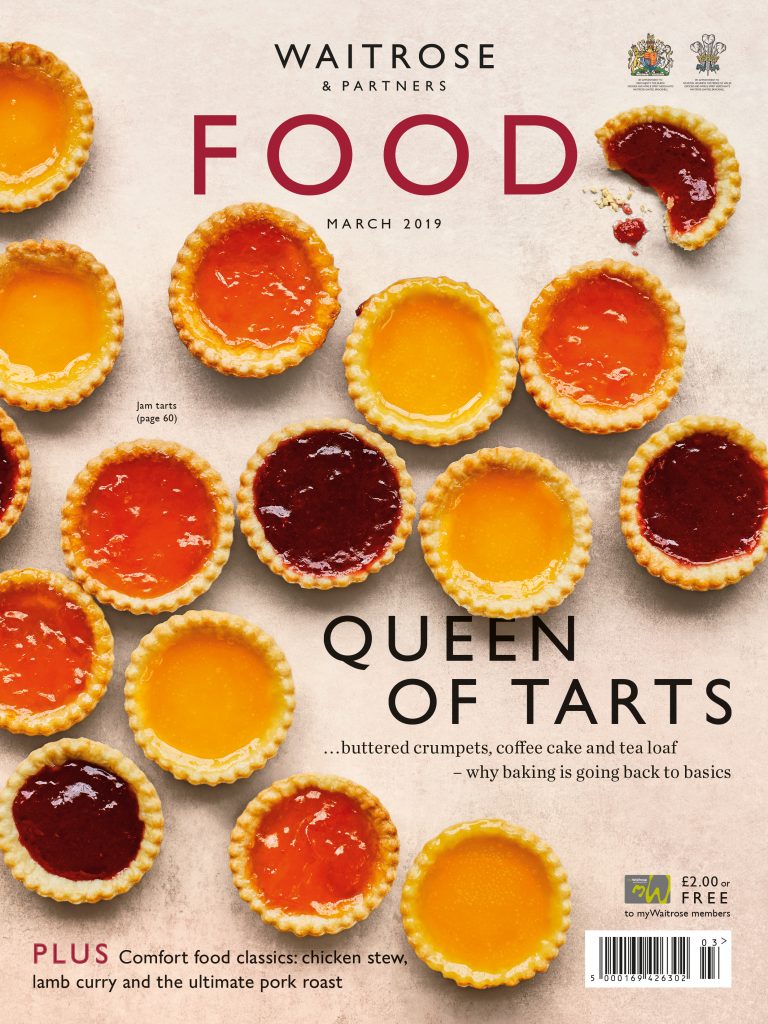
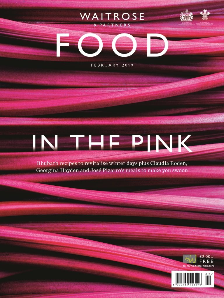
Jean… Let’s look at some of the cover photographs. Could you tell us about what visual impact you hope to achieve with your covers? When customers pick up a copy at the till, how does the cover influence their expectations and how do you think they feel when they see the cover?
Photograph: Laura Edwards, Food styling: Hattie Arnold, Styling: Tabitha Hawkins, Recipe: Jane Hornby
Alice… On our covers we celebrate different seasonal ingredients and recipes throughout the year, with a balance between eye-catching images, such as the rhubarb and eggs, and delicious recipes to entice readers, including the jam tarts and asparagus tart. My art director Kerry Wakefield, who designs and art-directs the majority of our covers, says that she feels she’s done a good job if readers want to either pick the food up off the page or put the cover up on their walls. We are aiming for nothing less than works of art!
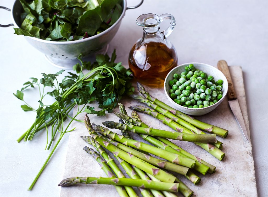
Photograph: Ant Duncan, Food styling: Matthew Ford
Jean… Finally we would love to know how you feel about your job, what gives you the most satisfaction and what tips you might have for anyone else who wants to get into a career in picture editing?
Alice… I really enjoy my role on the magazine, being part of a lovely team of people who create a stunning and interesting title each month is very rewarding. I get great job satisfaction from seeing the beautiful imagery that results from the shoots I organise, and from art-directing on set.
I studied photography at university which is useful for a career in the industry but not essential. Picture Editors seem to come from a lot of different backgrounds, but a passion for photography is key. It was through one of my tutor’s contacts that I heard of an internship at Wallpaper City Guides, which launched my career. I then progressed on to become a Picture Researcher and then Editor, picking up shoot-production experience as I went along. There are also short picture research courses available at institutes such as LSP, however I learnt on the job. Although internships are by no means ideal, looking for paid work experience or preferably an entry level Picture Assistant role is a good way to start a career in the industry. It’s useful to research print and online titles you would like to work for, and who publishes them, and look at the credits to get an idea of which stock libraries and photographers they use.
Photograph: Dan Jones, Food styling: Joss Herd, Styling: Wei Tang
It was a pleasure to meet Alice and talk about photographs in the context of the Waitrose & Partners Food magazine. The publication is a corner stone of the Waitrose & Partners’ marketing strategy. It acts as an ambassador for the Brand, offering a coherent story and a visual style which builds on the organisation’s reputation. Within its pages are images designed to convey visual messages which have an emotional connection with the wider world.
This is all highly compatible with the organisation’s internal story. Employees of John Lewis & Partners or Waitrose & Partners are automatically partners, an initiative set up by its founder in 1929. Working together as a team is company philosophy and a defining part of the culture.
In the branding world this Waitrose & Partners publication ticks many boxes, among them a strong brand identity kept fresh and relevant by a talented team who are focused on communicating the organisation’s personality and values. The magazine also adds value for readers. The team’s highly visual approach offers information, ideas and products targeted at common interests, illustrated and often humanised through photography. A winning way to build person to person relationships with customers.